Na Kim: SET v.19: graphic

A site-specific wall painting by Na Kim unfurling two-dimensional graphic designs for previous publications into three-dimensional spatial environments.
Curated by James Voorhies
Curatorial Research Bureau
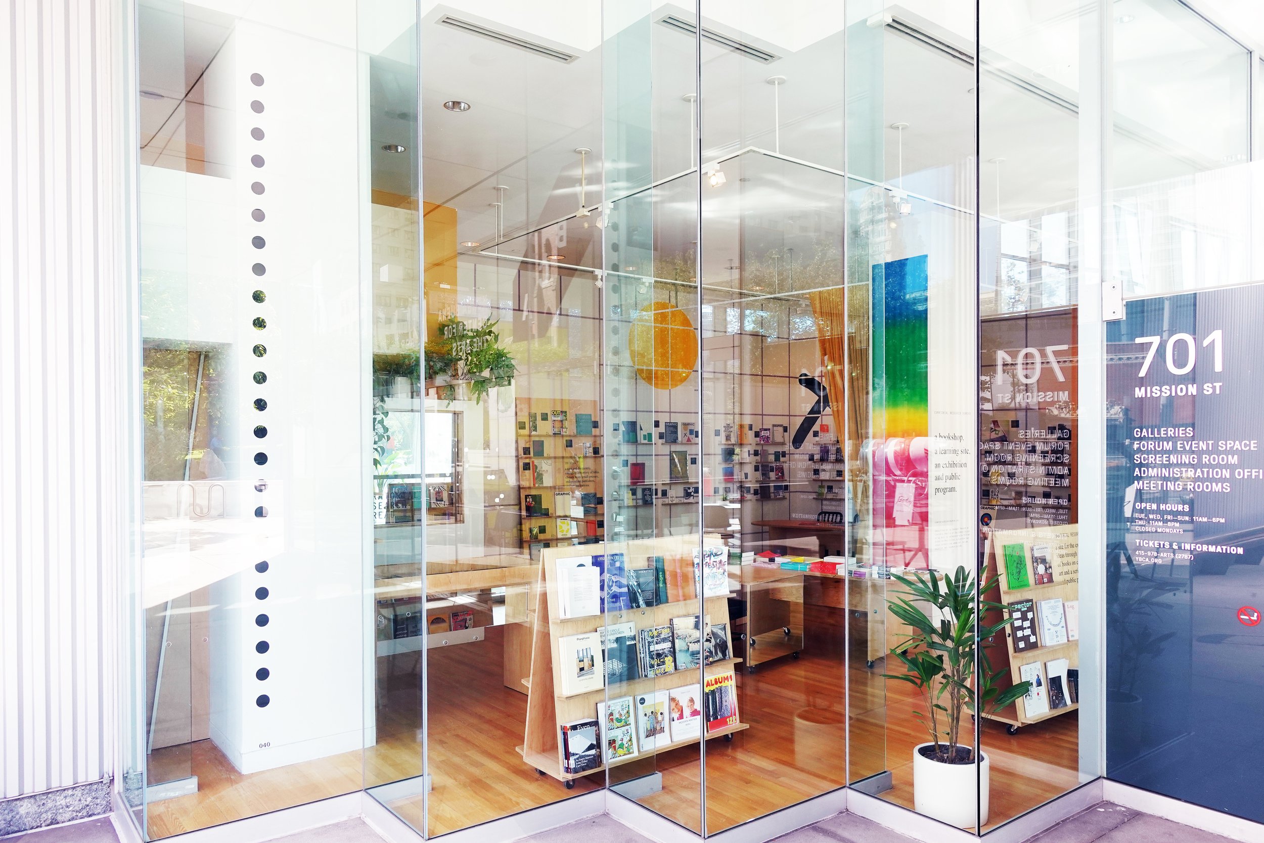
Yerba Buena Center of the Arts
701 Mission Street
San Francisco, CA
October 24, 2019–May 8, 2020
Made possible with funding and support from California College of the Arts and Yerba Buena Center for the Arts; realized within my responsibilities as Chair of the Graduate Program in Curatorial Practice at California College of the Arts
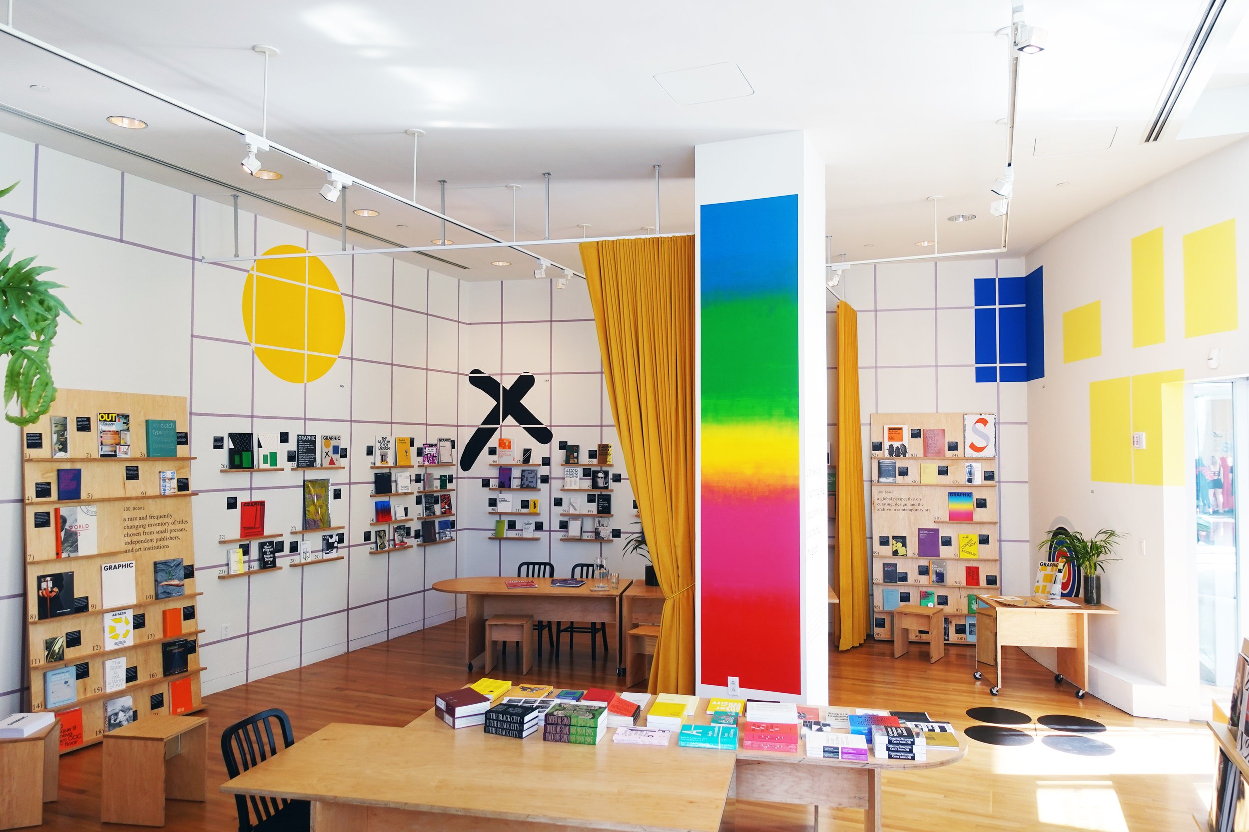
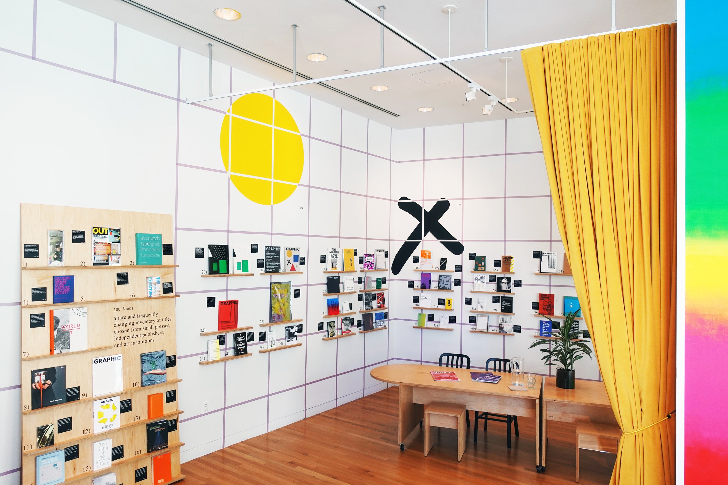
Na Kim is a designer, curator, archivist, and educator whose work inhabits and draws upon, indeed relies on the spaces of publications and exhibitions. This exhibition SET v.19: graphic was number 19 in an ongoing series titled SET. The series draws from the catalogue of visual iconography in her 2015 monograph of the same title published by Roma Publications. She uses formal design elements—color, pattern, geometry, typography, and text—from the monograph as a kind of graphic manual, a collection of signifiers each referring to previous visual moments in the Na Kim cosmology. The elements occasionally reassemble as graphic objects in the present reality of exhibitions, books, and performances—like this exhibition.
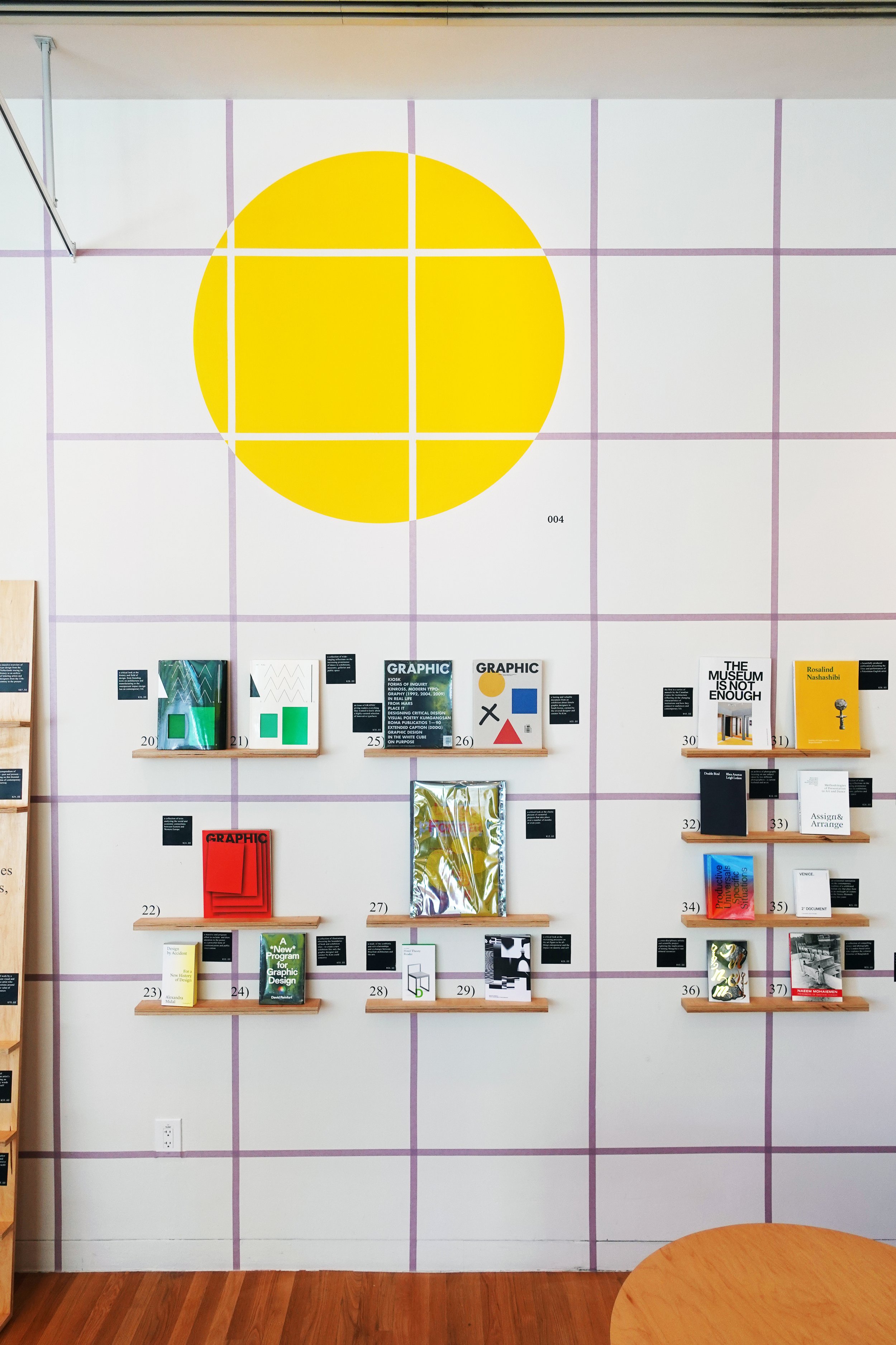
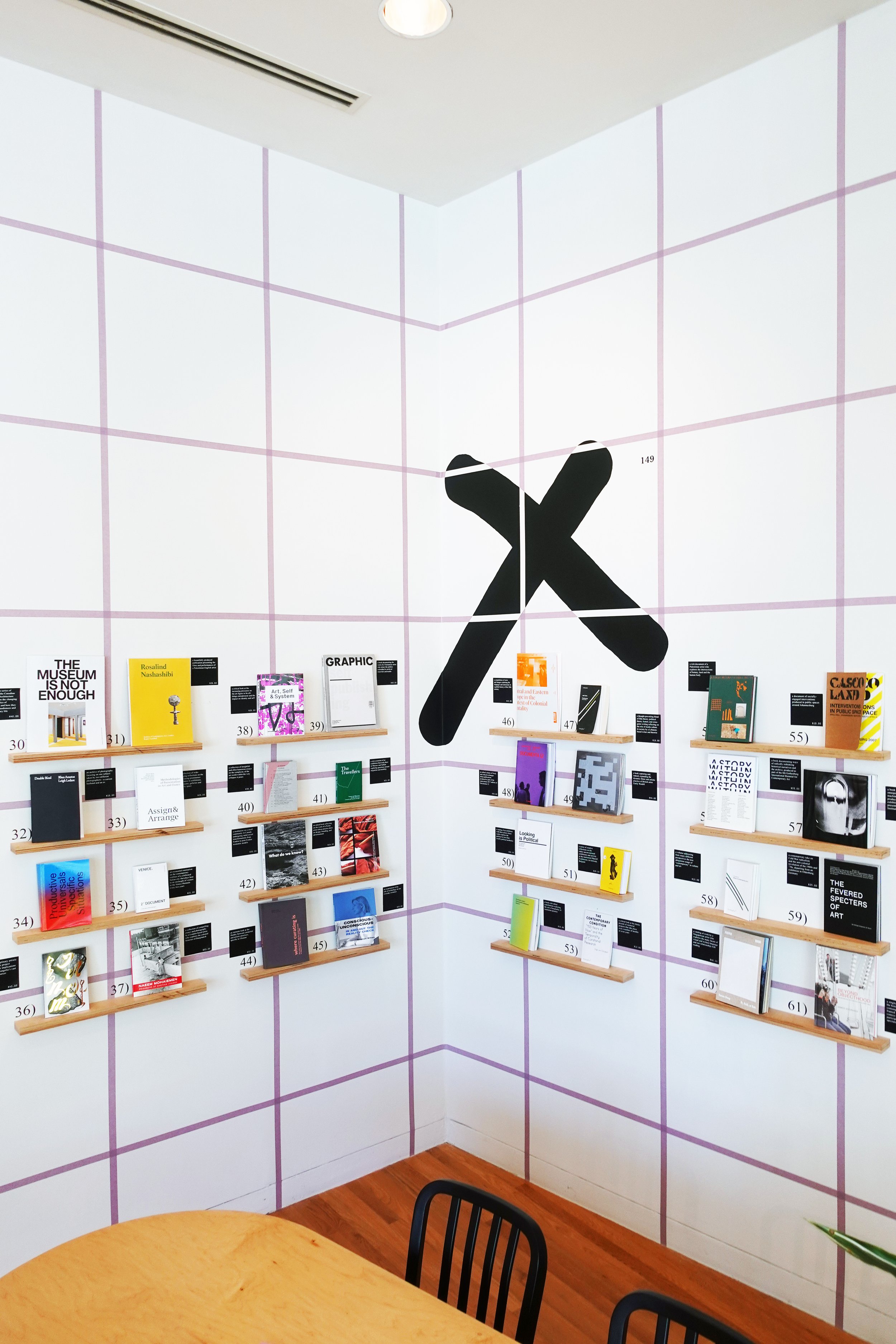
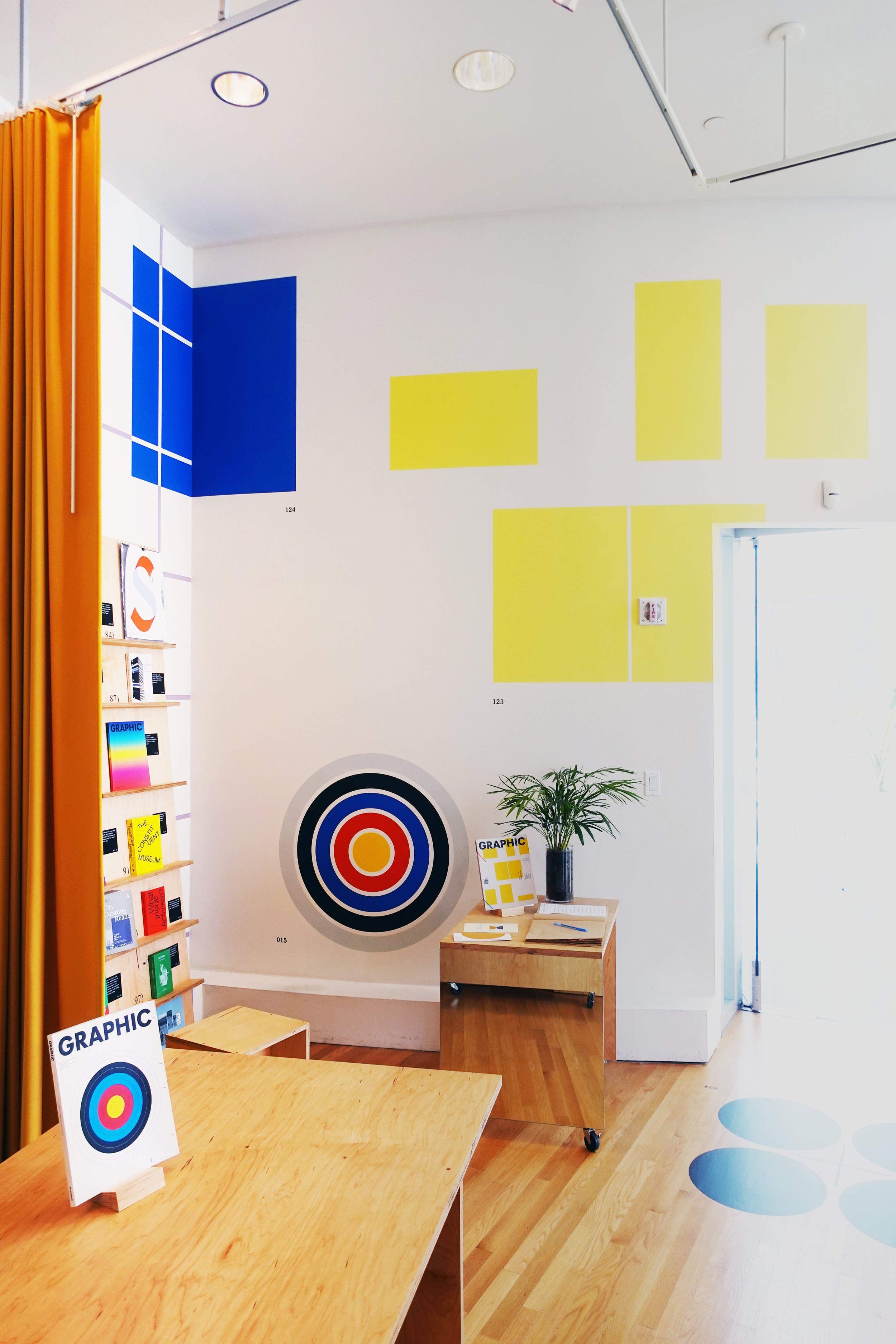
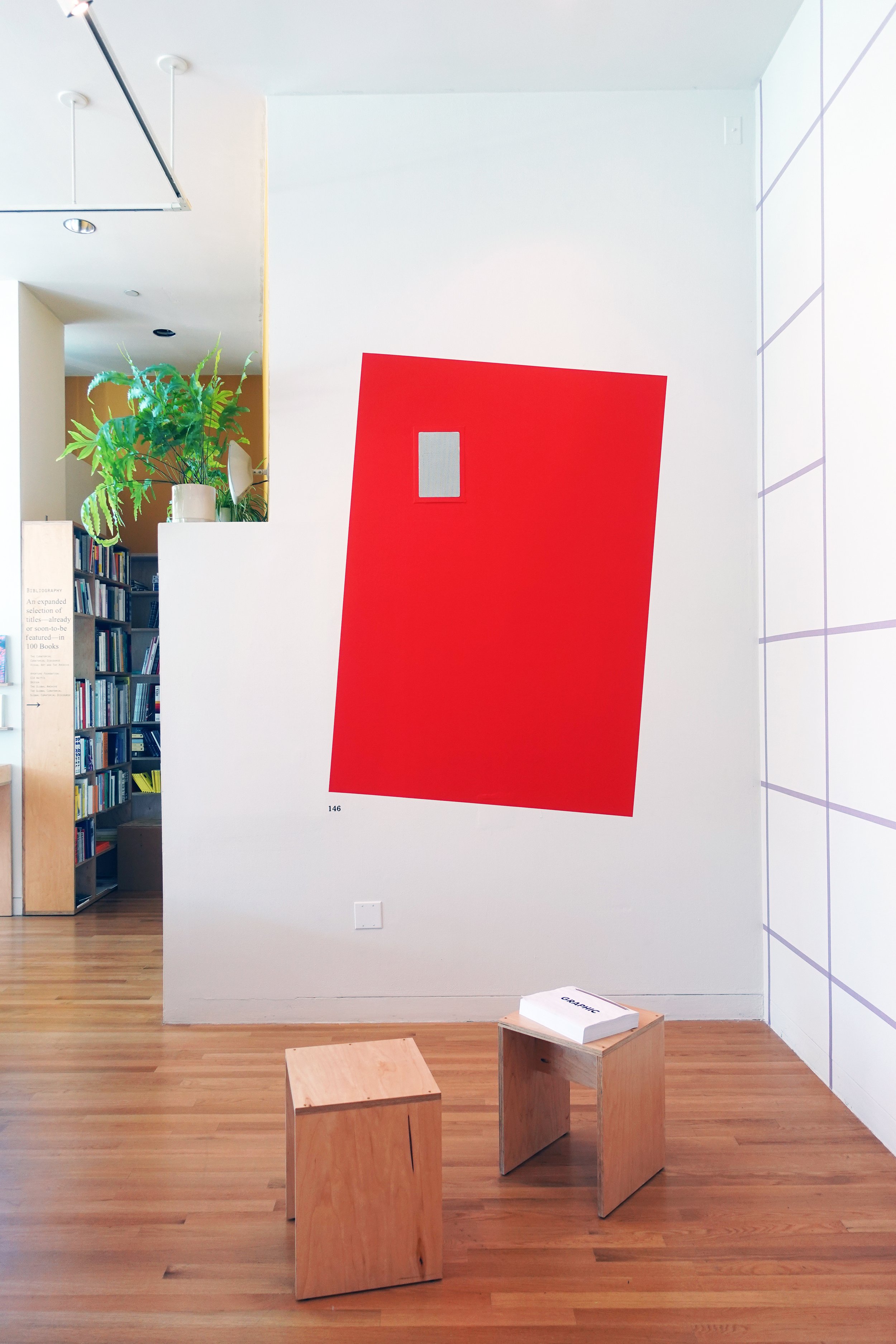
With each signifier, then, pointing to another place and time, SET v.19 had ten graphic objects referring to visual moments in past issues of GRAPHIC magazine published while Kim served as chief editor and art director from 2009 to 2011. Visitors found an aesthetic correlation among the bold graphics, each accompanied by a number. The numbers (like pages of a book) suggested that the elements were part of a larger collection—a set—and served as practical references to an index in Kim’s monograph-manual-archive SET.
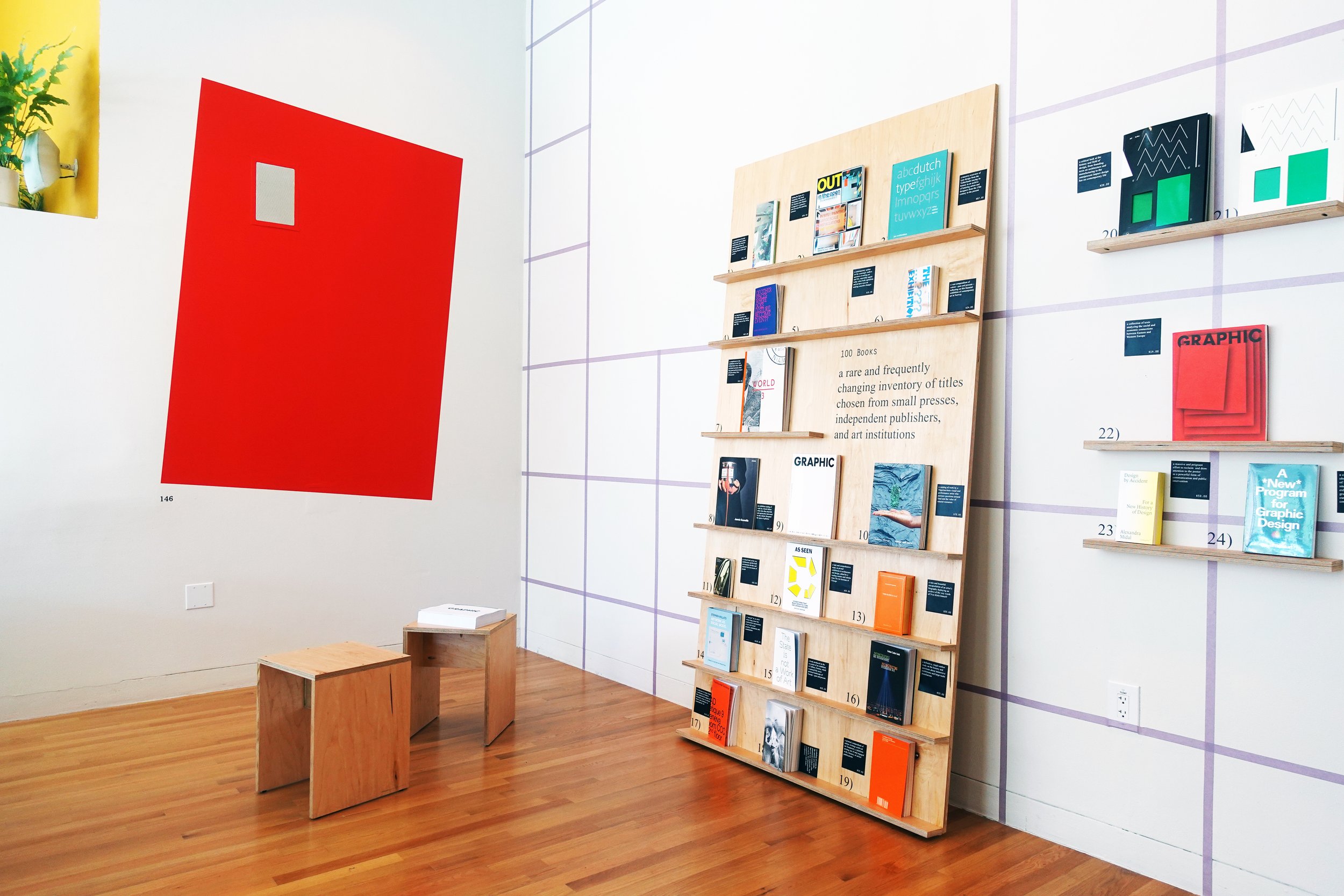
Painted on the focal wall, for example, a tilted red rectangle hailed from the cover of GRAPHIC #17: When Design Becomes Attitude (2011). The title refers to Swiss curator Harald Szeemann’s exhibition When Attitudes Become Form. In 1968, Szeemann invited artists to use the galleries at Kunsthalle Bern—tear them up, turn them into a studio, make a mess—in a curatorial gesture prioritizing artistic processes and methodologies over the final product to challenge the why, what, how, and where is exhibition. Kim used this legendary exhibition as a departure point for GRAPHIC #17. She profiled ten designers and studios whose dynamic and unconventional approaches to all-things design similarly embody challenges to, in this case, ingrained professional parameters of the field by redefining the why, what, how, where, and who is graphic design in their practices.
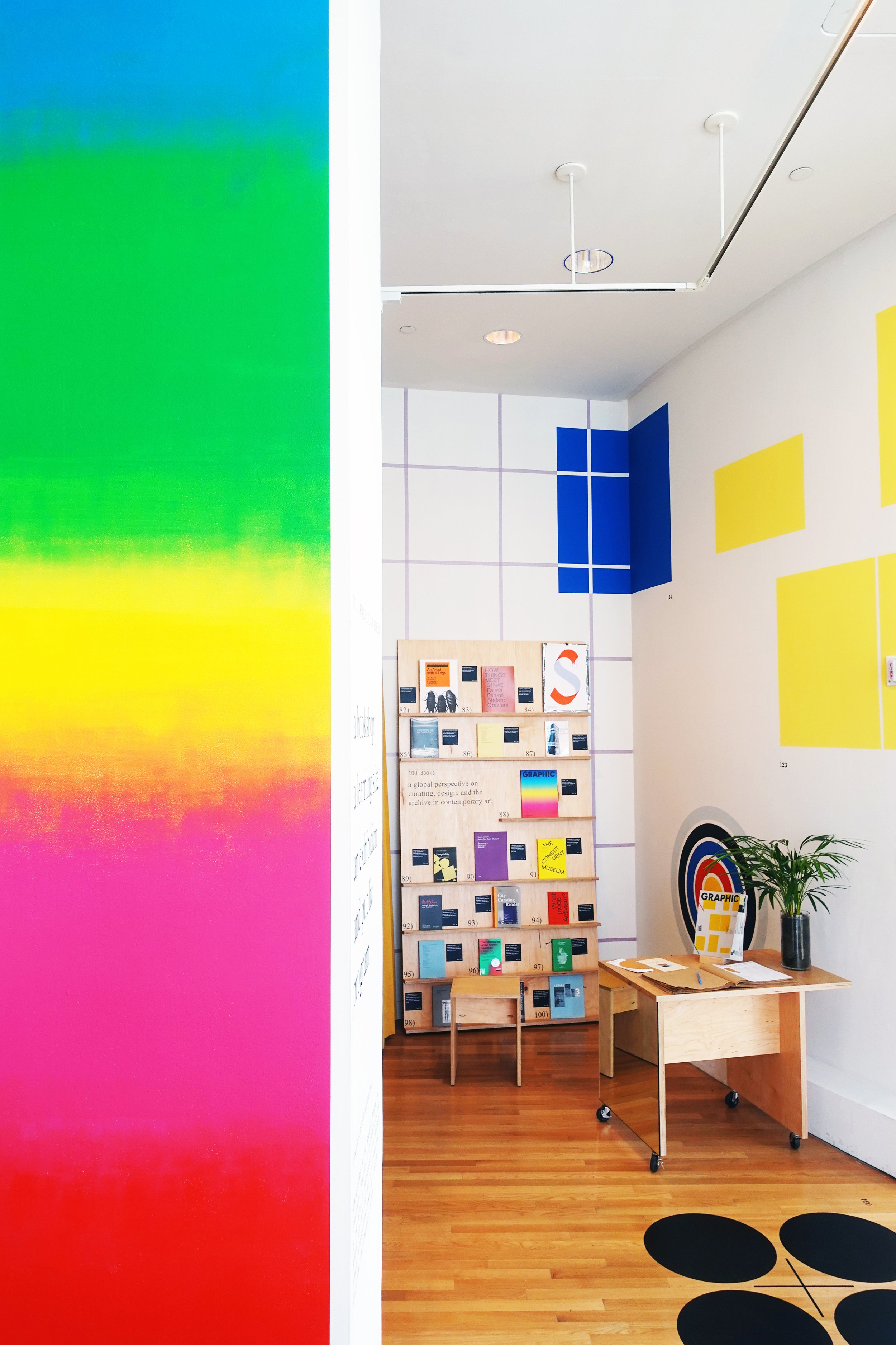
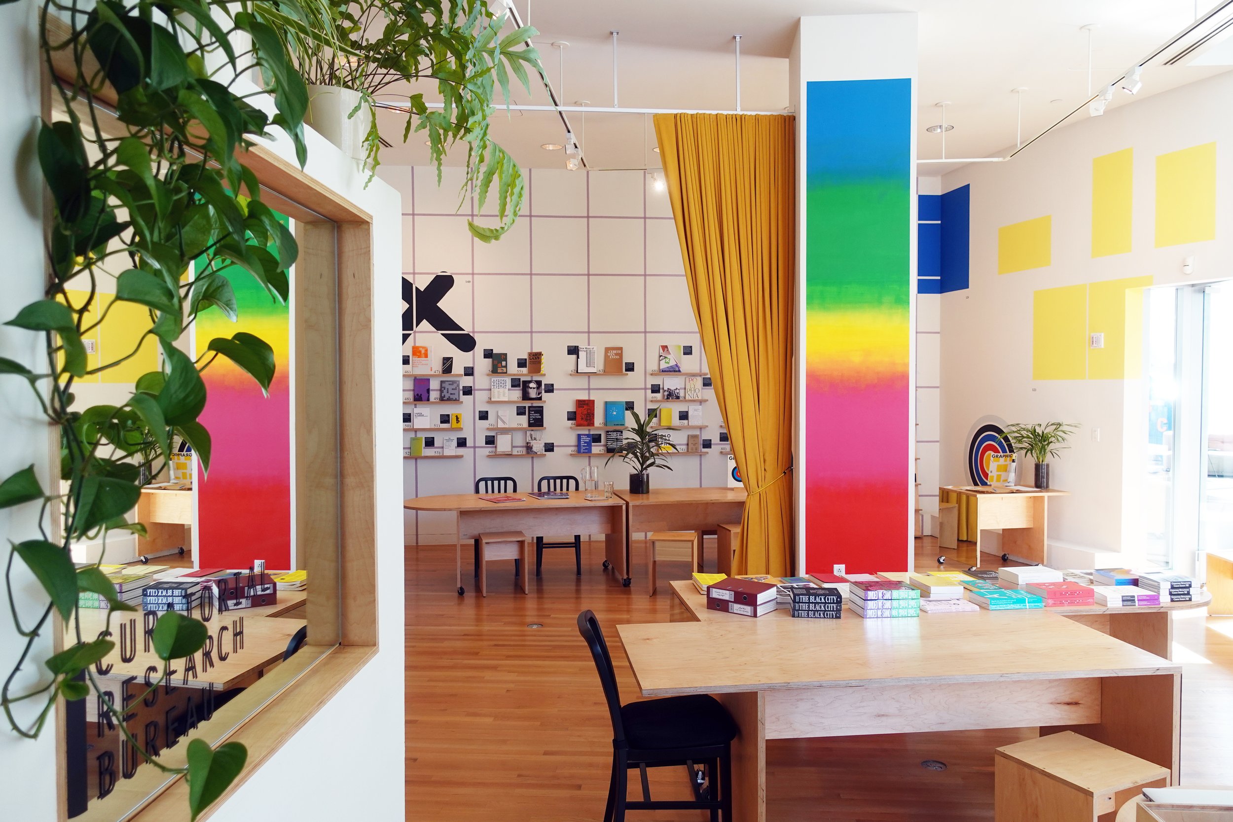
Other Na Kim graphics: a large “X” marked a wall. The hand-drawn contours were more informal and spontaneous compared to the other formal geometric forms, such as a large yellow circle nearby, above the display of books. The circle loomed overhead with a totemic presence while a blue square is literally painted into the opposite corner. These three visual elements can be found on the cover of GRAPHIC #18: Workshop Issue (2011). That issue is a paean to the workshop, a pedagogical model with a long and rich history in the field of graphic design. The workshop is often led by visitors for a small group of participants or students who are required to make something within a limited framework and in a condensed timeframe. GRAPHIC #18 has profiles of several outstanding workshops—from those organized by Åbäke, Julia Born, and James Goggin, to Min Choi, Our polite society, and Radim Peško—along with commentary by facilitators, teachers, and students.
And, then, there was the vivid color spectrum gradation painted on an 11-foot column in the center of the space. The gradation is a kind of signature element for Kim. In her archive, spectrums range from a few colors like red gradating into magenta into blue, to graphics with more complex spectrums. The gradation in SET v.19 had five colors. It originated from the cover of GRAPHIC: #15: Printing Journal (2010). That issue features profiles about noteworthy studios and printers such as Extrapool, Karel Martens, and Ana Vahtra. In addition, Kim deployed the actual printed pages of the magazine to experiment with different and sometimes challenging printing processes and techniques—like gradations.
Seven more visually seductive graphic element-objects and their corresponding indexical references awaited the attention and discovery of the reader-spectator, spectator-reader, performer-time traveler in SET v.19: graphic.
Na Kim makes sets in every sense of the word. Welcome to the set of a Na Kim exhibition.
Booklet
...